


All code can be found here Github Repo I use that repo as well for other tutorials so if you like my style of rambling writing it can be worth looking at.
Note: I'm not an expert, and there are many ways to do UI component testing.
Cycle 1
Picture this: You have just delivered a new feature, you've passed code review and you send it to QA for one last check that everything is working before releasing it to production.
QA tests and passes your feature 🎉 So a product/project manager tests the app before the final approval.
After a few hours (days) he reports that there are bugs in completely different places in the app which seemingly are unrelated to the feature you have been working on, and thus sends it back to you because it's your branch who introduces the issues.
Cycle 2
You notice that a style change in a commonly used UI component caused a lot of trouble all throughout the app. You fix it, test all the screens, even the ones that are not related to your feature, and send it off to QA, who sends it to PM who finally gives it the OK. 🍾! This extra cycle took 3 days. (or it took 2 weeks because it was a long weekend, and someone in the chain was sick at some point.)
Now obviously that's a lot of hands in the mix to test new code and each step in between is prone to a lot of bottlenecks. People get sick, holidays, and weekends, and the dog ate my laptop... you name it.
The Point
As you might expect: the second cycle would not be there if there was automated testing in the project. The tests would notify you that the code introduces errors in the app, and you would have fixed it even before sending out a request for code review. Boom, days, weeks saved from testing.
Believe it or not this is how most many projects are governed because everything is prioritized before writing proper tests (😱).
The Tutorial
Let's write a React Native Button component that is re-useable and tested.
The designer has given you the following specification for buttons
| Property | Values |
| Dimensions (HxW) | - standard: 40 x 200 - large: 60 x 200 |
| Primary type | - base color: blue - text color: white |
| Secondary type | - base color: red - text color: white |
And because we are l33t developers we also realize that we need to add some prop controls to this button because designers will change their minds. So we add controls for:
- baseColor: Type String to set the custom base color
- textColor: Type string to set custom text color
- height: Type number to set a custom height
- width: Type number to set custom width
following common API we also add a title prop and an onPress for a callback:
- onPress: type function to execute when button pressed
- title: type String to display inside the button
Alright, we know what to code so let's set up our component:
Actually! If you are looking for practice try to do it yourself first
import react from "react";
import { TouchableOpacity, Text } from "react-native";

export default function Button(props) {
  // destructure our props
  const { title, onPress, primary, secondary, height, width } = props;

  return (
    <TouchableOpacity onPress={onPress}>
      <Text>{title}</Text>
    </TouchableOpacity>
  );
}
Nice! Halfway done. Let's add styling and account for the different variants, for those who don't like nested ternary expressions: sorry... but not sorry.
import React from 'react';
import {TouchableOpacity, Text} from 'react-native';

export default (Button = props => {
  // destructure our props
  const {
    title,
    onPress,
    secondary,
    large,
    height,
    width,
    baseColor,
    textColor,
  } = props;

  if (!title) return new Error('No title added!');

  const HEIGHT = large ? 60 : height ? height : 40;
  const WIDTH = width ? width : 200;
  const BACKGROUND_COLOR = secondary ? 'red' : baseColor ? baseColor : 'blue';
  const TEXT_COLOR = textColor ? textColor : 'white';

  return (
    <TouchableOpacity
      style={{
        alignItems: 'center',
        justifyContent: 'center',
        backgroundColor: BACKGROUND_COLOR,
        height: HEIGHT,
        width: WIDTH,
      }}
      onPress={onPress}>
      <Text style={{color: TEXT_COLOR}}>{title}</Text>
    </TouchableOpacity>
  );
});
Let's talk about the conditionals for a bit:
HEIGHT- if
largeis truthy then setHEIGHT= 60 - if
heightis truthy then setHEIGHT= height - else set
HEIGHT= 40
- if
WIDTH- if
widthis truthy setWIDTH=width - else set
WIDTH= 200
- if
BACKGROUND_COLOR- if
secondaryis truthy setBACKGROUND_COLOR= 'red' - if
baseColoris truthy setBACKGROUND_COLOR=baseColor - else set
BACKGROUND_COLOR= 'blue'
- if
TEXT_COLOR- if
textColoris truthy setTEXT_COLOR=textColor - else set
TEXT_COLOR= 'white'
- if
Usage
We can see how even simple re-usable components can become quite complicated fast so when the project grows and new variants are added all the different combinations often culminate in many mutations.
Let's have a look at how we would use this component in our app:
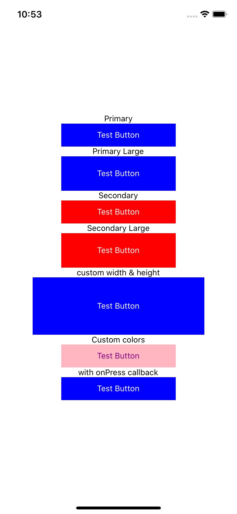
import React from 'react';
import {View, Text, Dimensions, Alert} from 'react-native';

import Button from './src/Button';

const {height, width} = Dimensions.get('screen');

const App = () => {
  return (
    <View
      style={{height, width, alignItems: 'center', justifyContent: 'center'}}>
      {/* Renders standard / primary button */}
      <Text>Primary</Text>
      <Button title="Test Button" />

      {/* Renders Large standard / primary button */}
      <Text>Primary Large</Text>
      <Button title="Test Button" large />

      {/* Renders secondary button */}
      <Text>Secondary</Text>
      <Button title="Test Button" secondary />

      {/* Renders secondary button */}
      <Text>Secondary Large</Text>
      <Button title="Test Button" secondary large />

      {/* Renders button with custom width & height */}
      <Text>custom width & height</Text>
      <Button title="Test Button" height={100} width={300} />

      {/* Renders button with custom baseColor and custom textColor */}
      <Text>Custom colors</Text>
      <Button title="Test Button" baseColor="lightpink" textColor="purple" />

      {/* Renders button with alert callback function */}
      <Text>with onPress callback</Text>
      <Button
        title="Test Button"
        onPress={() => Alert.alert('Button pressed')}
      />
    </View>
  );
};

export default App;
Rendered out we get this View in our simulator:
Testing with Jest and react-test-renderer
As I was talking about in the intro it's important that our components come with tests so we don't break stuff without even realizing it.
If you are following along you can go ahead and init a new react native project like this: npx react-native init MyApp command. When doing this the project comes with all the things we need right out of the box so let's give it a try and open up a console and run:
// yarn
yarn run test

// npm
npm run test
If everything is setup correctly you should see something like this:
yarn run test
yarn run v1.22.4
$ jest
 PASS  __tests__/App-test.js
  ✓ renders correctly (694ms)

Test Suites: 1 passed, 1 total
Tests:       1 passed, 1 total
Snapshots:   0 total
Time:        2.72s, estimated 3s
Ran all test suites.
✨  Done in 7.54s.
So let's get cracking with the testing and create a new file called Button.test.js, do the initial setup and add our first test.
/**
 * @format
 */

import 'react-native';
import React from 'react';
// Note: test renderer must be required after react-native.
import renderer from 'react-test-renderer';

import Button from './Button';

describe('Testing primary button', () => {
  const wrapper = renderer.create(<Button title="Test Button" />);

  it('Should render', () => {
    expect(wrapper.toJSON()).toBeTruthy();
  });
});
Explaination
wrapper:
You can call it anything you want, but often when reading other tutorials or documentation it will be called wrapper. At the top of the file, we import the renderer from react-test-renderer which will give us a type of container (or wrapper) for our component.
Let's go through the initial test where we test if the component rendered:
describe:
This marks the start of a new test suite in Jest, the first argument is a String where we describe what the encompassing test suite is testing and the second argument is a callback function where we continue writing our relevant tests.
it:
This marks the start of a new test in Jest. Tests should be as small and concise as they can be and only test one thing. As above, the first argument is a String, describing what the test is testing for, and the second argument is a callback function where we do the actual testing.
Inside of the it-block is where we generally do our Jest assertions, in this case, I'm converting our test wrapper into a JSON with .toJSON() and then I'm using the .toBeTruthy() assertion function provided by jest. (It just checks if it's not null or undefined)
I'm not going into all of those in this tutorial, here's a link to a cheat sheet: Link
Ok. So we want to test our button for all the different use cases that we have coded for so let's take a look at the different test cases:
- primary
- height: 40
- width: 200
- baseColor: blue
- textColor: white
- secondary:
- height: 40
- width: 200
- baseColor: red
- textColor: white
- large
- can be applied to all above
- custom width
- can be applied to all above
- custom baseColor
- can be applied to all above
- custom textColor
- can be applied to all above
I will only write out the tests for the primary button because the methods for the secondary button is the same.
If we write this out in a verbose way for the sake of clarity in code it might look something like this
Try to understand the code and then look at how I think about it
/**
 * @format
 */

import 'react-native';
import React from 'react';
// Note: test renderer must be required after react-native.
import renderer from 'react-test-renderer';

import Button from './Button';

describe('Testing primary button', () => {
  const wrapper = renderer.create(<Button title="Test Button" />);

  // Take a look at what the wrapper has inside of it
  console.log(wrapper.toJSON())

  // get's the styles of the wrapper
  const styles = wrapper.toJSON().props.style;
  // pulls the fields of interest out of the styles object
  const {height, width, backgroundColor} = styles;

  // get's the child styles
  const childStyles = wrapper.toJSON().children[0].props.style;
  // pulls the field of interest
  const {color: buttonTextColor} = childStyles;

  it('Should render', () => {
    expect(wrapper.toJSON()).toBeTruthy();
  });

  it('Should have height of 40', () => {
    expect(height).toBe(40);
  });

  it('Should have width of 200', () => {
    expect(width).toBe(200);
  });

  it('Should have blue background', () => {
    expect(backgroundColor).toBe('blue');
  });

  // Child Tests
  it('Should have white text', () => {
    expect(buttonTextColor).toBe('white');
  });
});
Step-by-step explanation
We want to get the wrapper styles and test them.
- styles
When testing that a component has the correct styling I make heavy use of that I can get the information of our test wrapper written out to me in JSON format. We can see how this looks like if we call
console.log('wrapperJSON', wrapper.toJSON()). It gives me the following output =>
console.log src/Button.test.js:15
      wrapperJSON {
        type: 'View',
        props: {
          accessible: true,
          style: {
            alignItems: 'center',
            justifyContent: 'center',
            backgroundColor: 'blue',
            height: 40,
            width: 200,
            opacity: 1
          },

          ... Removed irrelevant things ...

        },
        children: [ { type: 'Text', props: [Object], children: [Array] } ]
      }
From this output we see that the topmost rendered node in the tree is a type View, and further we can see inside props.style where we can see all the styles, so we can pull this information out and use Jest assertions to test if they are what we expect.
One way to pull this data out for us to use is like this:
  // get's the styles of the wrapper
  const styles = wrapper.toJSON().props.style;

  // pulls the fields of interest out of the styles object
  const {height, width, backgroundColor} = styles;
or more compact would be
  // get's the style fields of the wrapper
  const {height, width, backgroundColor} = wrapper.toJSON().props.style;
And then we use them in our test cases as:
  it('Should have height of 40', () => {
    expect(height).toBe(40);
  });
Testing the styles of children
We want to test that our textColor is what we expected.
From our earlier output log, we saw a field called children which is an array of all the children seen from the root node in our render tree. Further, with some investigation, we see that we only have one child in this case, and we can pull console.log out the styles like so:
console.log('Children styles', wrapper.toJSON().children[0].props.style);
Clarification:
first in the array .children[0] and then .props.style gives us the styles object.
which get's us the following output:
console.log src/Button.test.js:22
      Children styles { color: 'white' }
and we can use them like the parent like this (for example)
  // get's the child styles
  const childStyles = wrapper.toJSON().children[0].props.style;

  // pulls the field of interest
  const {color: buttonTextColor} = childStyles;
I make use of re-naming in the destructuring so the variable name makes more sense
and using the same type of test case as above I land on this test case:
  // Child Tests
  it('Should have white text', () => {
    expect(buttonTextColor).toBe('white');
  });
After understanding these techniques we can easily write tests for all the other Button permutations.
Run the tests again and see how it looks:
yarn run test
yarn run v1.22.4
$ jest
 PASS  __tests__/App-test.js
 PASS  src/Button.test.js

Test Suites: 2 passed, 2 total
Tests:       6 passed, 6 total
Snapshots:   0 total
Time:        3.536s
Ran all test suites.
✨  Done in 6.20s.
Boom!
All green ok, so let's take a look at what we have left to test for our primary button.
- large
- can be applied to all above
- custom width
- can be applied to all above
- custom baseColor
- can be applied to all above
- custom textColor
- can be applied to all above
I'm going to be honest, I'm still figuring out how to do these variations effectively but one way is to make smaller more compact test suites where each test is more self-contained, where we create different test wrappers and test the styles with the method above, for instance like this:
describe('testing other primary variants', () => {
  it('large button', () => {
    const wrapper = renderer.create(<Button title="test" large />);
    const {height, width, backgroundColor} = wrapper.toJSON().props.style;
    // Child
    const {color: buttonTextColor} = wrapper.toJSON().children[0].props.style;

    expect(height).toBe(60);
    expect(width).toBe(200);
    expect(backgroundColor).toBe('blue');
    expect(buttonTextColor).toBe('white');
  });

  it('custom width button', () => {
    const wrapper = renderer.create(<Button title="test" width={333} />);
    const {height, width, backgroundColor} = wrapper.toJSON().props.style;
    // Child
    const {color: buttonTextColor} = wrapper.toJSON().children[0].props.style;

    expect(height).toBe(40);
    expect(width).toBe(333);
    expect(backgroundColor).toBe('blue');
    expect(buttonTextColor).toBe('white');
  });
});
Here I pulled everything together into separate tests, which is a less verbose way of writing everything out explicitly.
Let's run the test command again and see if everything is good:
yarn run test
yarn run v1.22.4
$ jest
 PASS  __tests__/App-test.js
 PASS  src/Button.test.js

Test Suites: 2 passed, 2 total
Tests:       8 passed, 8 total
Snapshots:   0 total
Time:        3.141s
Ran all test suites.
✨  Done in 6.90s.
Now give yourself a pat on the back because your button is tested and ready to ship. 🎉🍾
I would really like some input from someone who is a testing expert who maybe can piggyback on this post and show some examples of how to write tests in a better way.
Code Examples Code
Thanks!
Subscribe for updates directly to your inbox !
Looking for a remote software job? Check out my side project at remoet.dev 🚀 it's a large collection of resources for finding remote software engineering jobs.